We are working on VR TRAINER, a virtual training ground for the clinical procedures.

Multimontøren

Branding, marketing and website development for the company that does the heavy lifting.

Visit website

Our challenge

Multimontøren has many years of experience and expertise moving machinery and factories, as well as offering service and maintenance. Through the years, the company has built up a reputation for service-mindedness and putting out quality work.

The challenge was not only creating a visual design line which supports their professionalism and great know-how, but also to ensure that the company sets itself apart of the competition.

Rather than focusing on technology or size, we chose to work with social values and relations. The storytelling centered around the human aspect and focused on good relationships and respect for the craftsmanship.

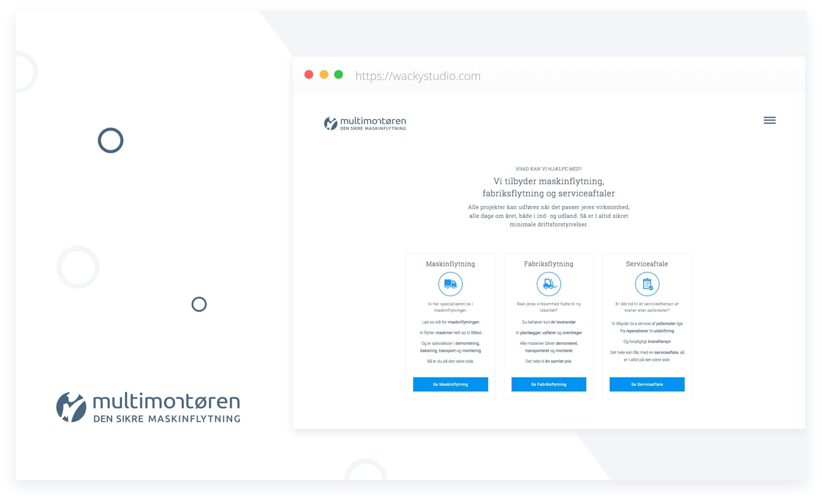
Multimontøren branding - Wacky Studio

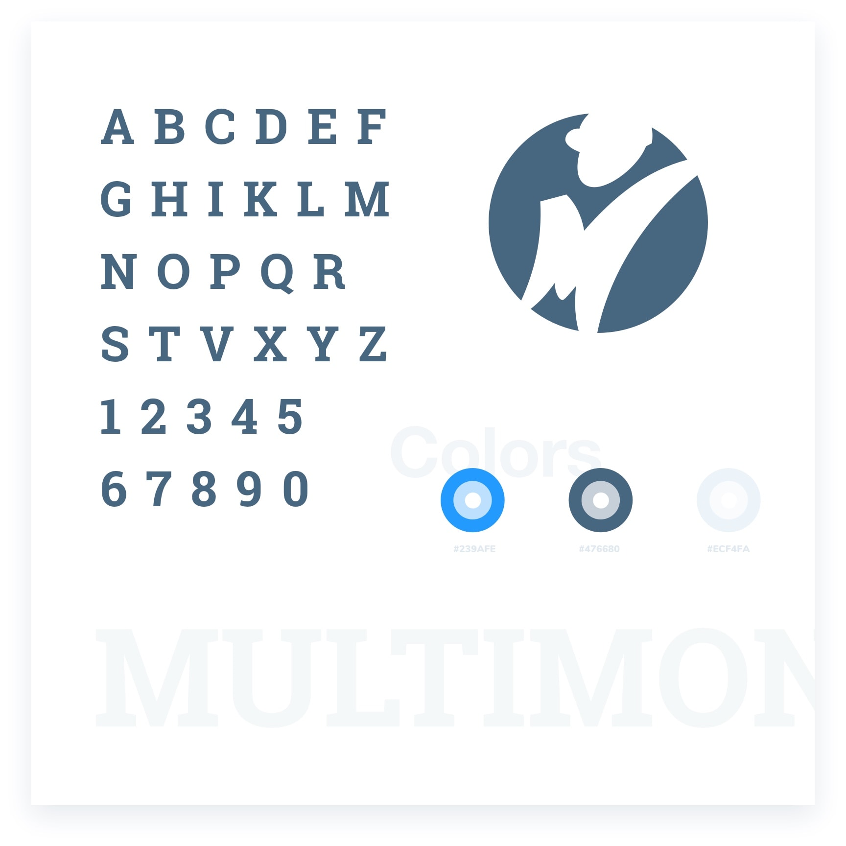
The simple look, the clean color palette, and a modern but subtle typeface.

Our approach

Our goal was to develop a brand, which supported the successful relationships and the great know-how that had developed throughout the years.

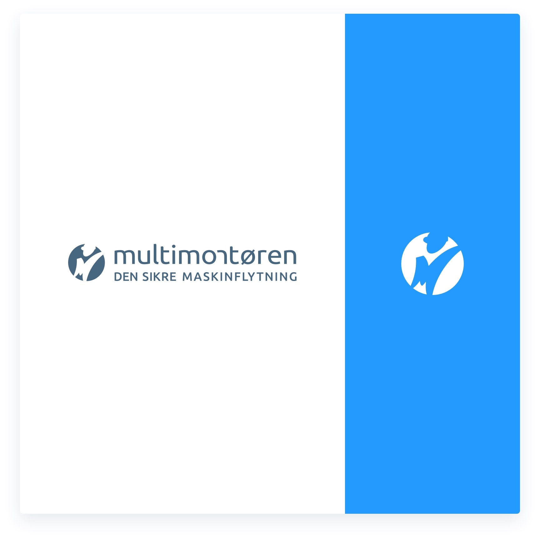
We began the brand exploration by making a modern and smooth logo design, which was to become to center of the design line and the visual expression. The simple look, the clean color palette, and a modern but subtle typeface with visual and broad appeal.

Multimontøren branding - Wacky Studio

The solution

We developed an extensive and modern brand, which supported the professionalism and great know-how that defines Multimontøren. The design line was clean, straghtforward and simplistic with a clear message.

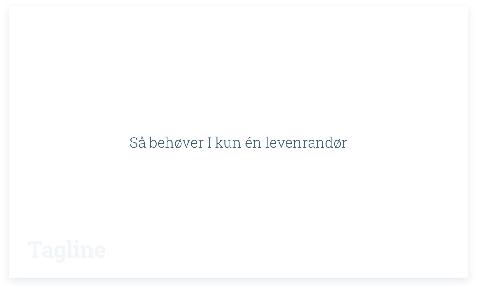
Our goal was to create precise, communicative messages to supplement the visual expression, summarizing everything in plain sentences.

"Machinery moving made safe", "We specialize in moving machinery", "The only supplier you need", "Lifting in unison".

Multimontøren branding - Wacky Studio

Our conclusion

We have created a modern and long-lasting brand, which supports the core values at Multimontøren. The main focus was on relations and the narrative of well-executed craftsmanship supported by clean, transparent communicative sentences.

The website was given an effortless look, smooth graphical elements and a muted, trustworthy color palette all of which interact well together. A clear marketing strategy, print materials and SEO optimization was subsequently devised and implemented.

Project Partners

We collaborated with

Used expertise

  • Branding
  • Design strategy
  • User interface design
  • User experience design
  • Logo design
  • Website