We are working on VR TRAINER, a virtual training ground for the clinical procedures.

TUNPROTEC

New visual identity and development of a concept website for the launch of TUNPROTEC for VID Fire-Kill

Visit website

Our challenge

VID Fire-Kill is at the very top of innovative development and production of water-based firefighting products. VID Fire-Kill specializes in fixed water-based systems, utilizing environmentally friendly fire extinguishing methods.

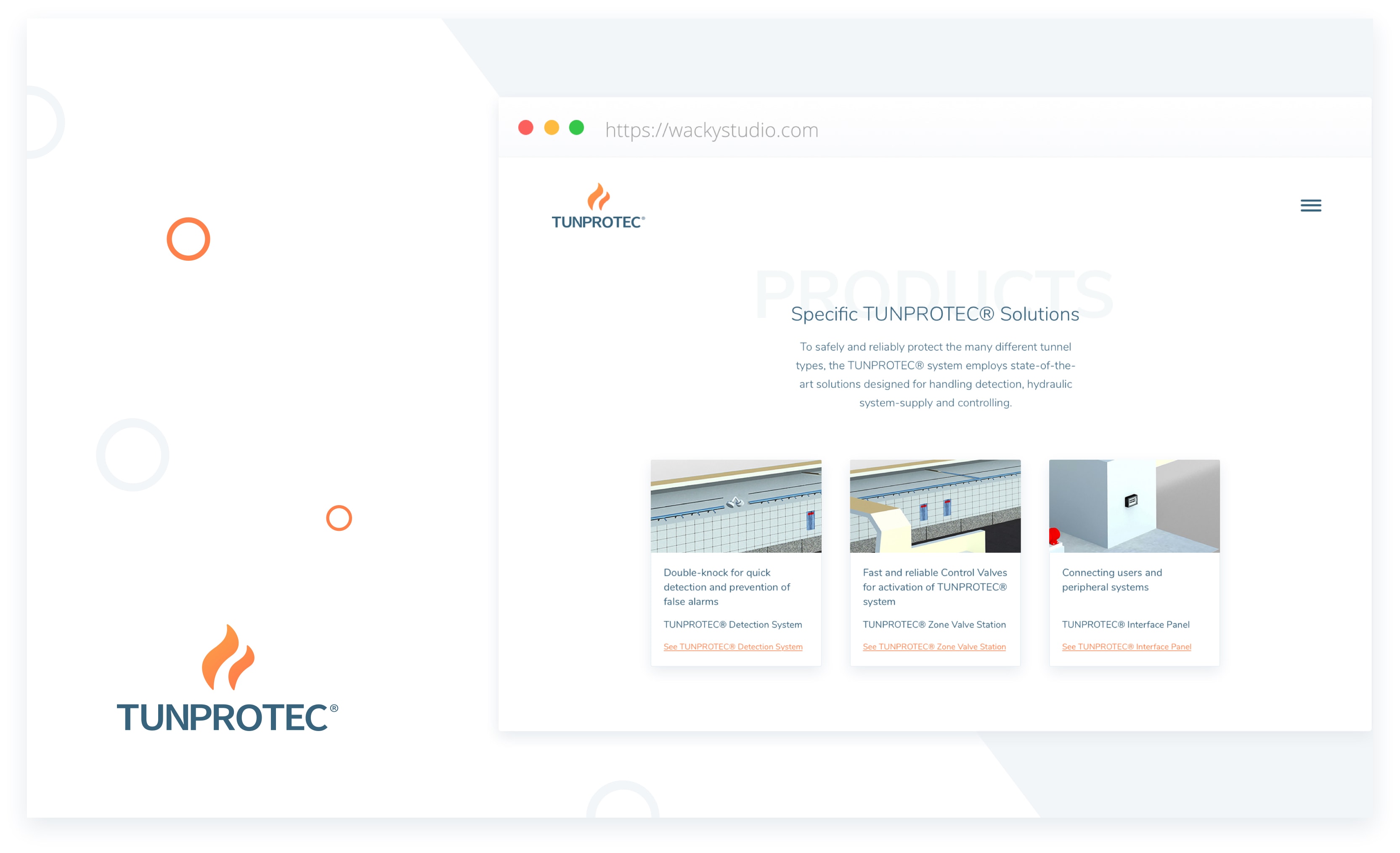
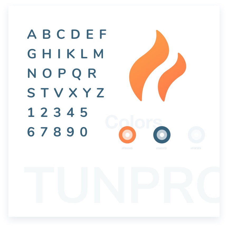
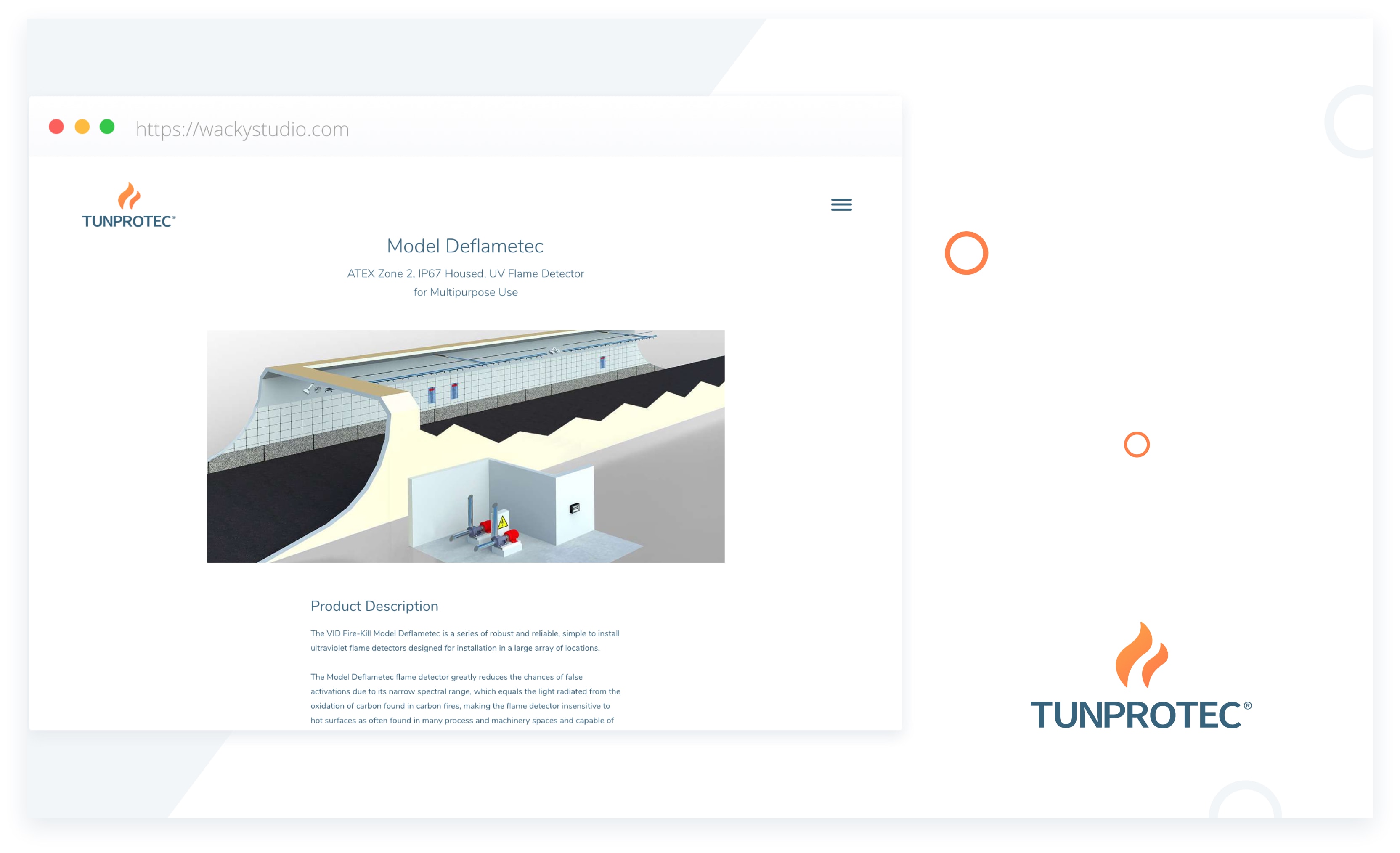
VID Fire-Kill contacted us about the design and development of a new visual identity for the launch of the product TUNPROTEC, which is manufactured specifically for fire safty in tunnels.

TUNPROTEC visuel identitet - Wacky Studio

The visual storytelling in the narrative about dedication to safety is engaging and real.

Our approach

We wanted to create a visual identity revolving around the basic principles of TUNPROTEC. A product with a visual narrative about well-executed craftsmanship to create safety and save lives in the event of disaster.

TUNPROTEC was set apart from its business competitors through a unique color palette, a subtly powerful typeface, its own effective logo, and a distinct story.

The visual identity includes logo, website, print materials and photography.

TUNPROTEC visuel identitet - Wacky Studio

The solution

We began by designing the distinct flames at the center of the brand and then created a system to incorporate them in the visual narrative. We chose a compelling yet subtle typeface to be used across all platforms. The assertive color Intense Orange made up the cornerstone of the color palette.

We set out to create a simplistic and smooth visual expression to present TUNPROTEC as the innovative and safe choice of fire extinguishing product for tunnels. The website was developed using straightforward interactions and clean design elements, perfectly mirroring the quality of solutions delivered by TUNPROTEC.

TUNPROTEC visuel identitet - Wacky Studio

Our conclusion

TUNPROTECT has a strong and poignant visual expression to establish the solution as the leader within the field. Using straighforwardness and clean lines sends a clear message and keeps the focus on the elements of the TUNPROTEC solutions.

The website is uncomplicated without distracting graphics, which makes accessibility the main goal. The combination of typeface and color puts the contents at center stage, minimizes noise and guides the user through the experience.

VID Fire-Kill received a visually strong and impressive identity for TUNPROTEC which is loyal to the products and the efforts of the company.

Project Partners

We collaborated with

Used expertise

  • Branding
  • Design strategy
  • User interface design
  • User experience design
  • Logo design
  • Laravel & Vue.js based website